What’s The Standard Window Height From Floor & Ceiling?

Are you thinking of installing windows to make your home look more modern, but are unsure of what the standard window height is from the floor and the ceiling? If you want to find out, then keep reading.

A standard window is placed anywhere between 2.9 feet and 3.1 feet above the floor height and between 17.9 inches and 18.1 inches from the ceiling. You must follow the 2018 International Residential Code to ensure safe evacuation in cases of a fire breaking out or other emergencies.

Experts in the construction industry say that the standard window height from floor and ceiling is a guideline and that they are lucky in the sense that they follow the plans of a designer or architect. It is also vital to follow the local building codes. This post will include some of these building codes as well.

The Standard Window Height From Floor And Ceiling

When a contractor installs a window in a building, they have access to a blueprint or a plan. The contractor and the team can then follow this plan to establish where the doors and the windows will be. If you have to install a window without a plan, you can follow a guideline like this. 

The two heights to consider are the Lintel dimension, which is the space from the floor all the way to the top section of the doorframe, and the Sill dimension, which is the space between the floor and the start of the window sill. This section of the post will focus on the dimensions of a window from the floor and the ceiling.

The Standard Window Height From The Floor

The standard window height from the floor is between 2.9  feet and 3.1 feet above the floor height. These are the same dimensions that most contractors use. Contractors use these dimensions because everyone needs to comply with the International Residential Code and the national fire protection association codes concerning emergency escape points.

If windows are located too high, it would not be possible for people to escape a fire, so you must comply with these codes. The codes require 24 inches high and more than 20 inches wide opening. You can meet this requirement with a working door or window.

Of course, windows are not all the same size and the other important point to consider when selecting the perfect position for your window is the way that the window will be proportioned with all the other features of your home. It would look unappealing if your windows took up all the space in a room or if they were way too small.

A great guideline is to look at the top line of your doorframe because many people prefer to have bigger windows that will fit in at the same height as the door.

The Standard Window Height From The Ceiling

The standard window height from a ceiling is between 17.9 and 18.1 inches below the ceiling. This distance gives the homeowner enough space to install curtain rails and will ensure that the wall remains sound. This space will also depend on the type of window you are installing. The dimensions will decrease if you are using a window that goes from floor to ceiling.

If you use smaller windows, it will also increase the space, so make sure you always plan ahead before starting any work. The windows that you select will make a big difference in the look and the general feeling of your home. In the following part, we will look at a few examples of standard window types and the height that they will be from the floor and the ceiling.

Calculations For Window Height From The Floor And Ceiling

The calculations will start at the height of the Lintel, which means it is the distance from the floor to the top section of the door frame. The standard doorframe is 7 feet. The ceiling will start another 18.1 inches above the door frame. When installing a window frame, the sill or the bottom of the window will be at 3 feet. 

Make sure that the frame you use will look aesthetically pleasing by using these calculations. You will get time to practice these calculations in the next section.

Standard Window Types And Height From The Floor And Ceiling

This post section will focus on a few window types and their height from the floor and the ceiling. There is a bit of math to do in this part as well, so make sure to get your calculator. The window types that we will look at are:

  • Casement style window.
  • Fixed style window.
  • Sliding style window.
  • Double Hung Style window.

Casement Style Window- 3.5 Foot By 2.5 Foot

Black frame aluminium windows of buildingBlack frame aluminium windows of building

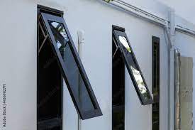
Casement-style windows open horizontally with a hinge holding the opening side in place. The height of this example is 3.5 feet which means that the sill height (window to the floor) of this window will be 3.0 feet, and the height to the ceiling will be 68 inches from the top of the window.

Fixed Style Window- 4.0 Foot By 5.0 Foot

adjustable glass louver window on a walladjustable glass louver window on a wall

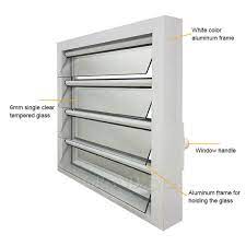
Fixed style windows do not open or close at all, consisting of a glass pane within a frame. The height of this example is 4 feet which means that the height from the floor to the window sill will be 3 feet, and the ceiling height will be 18 inches from the top of the window.

Sliding Style Window- 3.0 Foot By 3.0 Foot

Living room with sliding glass door to balcony

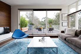
Sliding-style windows consist of windows that slide from side-to-side on horizontal tracks. One or both windows can slide. The height of this example is 3.0 feet which means that the sill height(window to the floor) of this window will be 3.0 feet, and the height to the ceiling will be I feet and 18 inches from the top of the window.

Double Hung Style Window- 4 Foot By 6.0 Foot

A light blue wooden horizontal clapboard covered house with a double hung pane windowA light blue wooden horizontal clapboard covered house with a double hung pane window

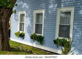
Double-hung windows have two framed units with glass that slide up and down in a vertical fashion. The height of this example is 4 feet which means that the height from the floor to the window sill will be 3 feet, and the ceiling height will be 18 inches from the top of the window.

There are more window styles, but these are the ones we have space for in this post. There are, of course, multiple sizes of window frames as well, which is why it is so critical for you to plan for any renovation. Also, ensure that the frame gets installed by a qualified tradesman who can level everything out.

Conclusion

The height of standard windows is not standard at all, as windows come in various types and sizes; thus, they are all different. The standard height of a door frame is 7 feet, and the ceiling is another 18.1 inches above that. 

Window sills normally start at the height of 3 feet which makes the calculation easy to follow. The various types of window styles have different sizes, so it is imperative to plan and calculate where exactly the window will be going. Choose the right style window for your home and have fun installing them.

23 Genius Ideas For What To Do With A Spare Room

Many people find themselves lost on what they can do with a spare bedroom. While it’s a great place to set up an overnight room for guests, you may prefer to do something a bit different. We’ve come up with 23 genius spare room ideas to get you started. We hope these suggestions inspire you to do something fun with your extra room while making it functional. 

Old-Fashioned Dressing Room

Are you someone who’s got a ton of clothes but no space to try on outfits? Then, turning your spare room into an old-fashioned dressing room is the perfect solution. 

It doesn’t take much to convert the room into a shopper’s paradise. Place a tall mirror on the wall so you can model your clothes. Or consider a folding mirror that allows you to see from different angles. An antique dressing screen will add style and function to the area.

You can also bring in a vanity, organizers for your shoes and accessories, and a place to store your clothes. 

Home Cinema

A fantastic idea for movie buffs is to turn the spare room into a private home cinema. Now it may take some time to save up the money to transform the space into a cinema space, but you can start at any time with what you have on hand and upgrade over time.

The first thing any good home cinema needs is a large TV. You’ll also need comfortable seats. An oversized couch, loungers, or recliners would suffice. 

Decorations could include a mini-fridge, framed movie posters hung on the walls, a popcorn machine, and a surround sound system for excellent audio quality. You may also want to consider ways to incorporate soft lighting and a plush rug in case anyone wants to lay on the floor.

Home Office

Working from home has become more popular than ever. However, if you don’t have a dedicated office area in your home, you could find doing your daily work challenging.

You can choose to convert the entire spare bedroom into a home office or dedicate a portion of it as your workspace while leaving the remainder of the room for other activities. 

A desk, power outlets, office supplies, and a comfy chair are essentials. You may also want to choose a paper tower for organizing files or papers on your desk, a filing cabinet, and other organizational items to keep things tidy. And unlike your office at work, you can paint the walls an inspiring color and hang fun pictures to create an office haven. 

Study Corner

A spare bedroom can be a lifesaver for individuals who work from home. It’s also great for those who do online schooling. In addition, having a dedicated study corner helps increase attentiveness, organization, and participation. 

You can use whatever items you prefer for your study corner, whether you use an old table or an actual desk for your workspace. However, it’s always a great idea to keep the area tidy and organized to prevent procrastination and distractions. 

Place materials, supplies, and other loose items stored within easy reach, so the workspace stays clear, but you still have everything nearby for when the need arises. 

Music Room or Recording Studio

A spare room is every musician’s dream. So instead of filling your extra room with a bunch of junk, use the space as a dedicated music room. Or go a step further and turn the room into a recording studio.

In the beginning, you can start converting your spare room into a music room by bringing in all of your music equipment. Hang fun art on the walls, or go for a unique look by framing vinyls. If you have autographed items, display them proudly for easy decorating. 

As you get more serious about your music, you may want to make changes that turn the room into a legit music studio. This process would require you to soundproof your area and possibly invest in more expensive equipment.

Expand Your Bathroom

If you’ve dreamed of a luxurious master bathroom, but there’s no space available, consider whether you can expand your bathroom into a spare bedroom.

Doing this does mean two things. First, the spare room has to be next to your bedroom if you want it to connect. And second, depending on how big you make your master bathroom, you will lose the entire bedroom space. 

Expanding your master bathroom allows you to have a huge walk-in shower, large soaking bath or jacuzzi, double sinks, a dressing area, and a private toilet room. You can even add closets if you need more space for clothes.

Laundry Room

Some people transform their spare room into a large laundry room. Having a bedroom turned into a laundry room gives you maximum space and makes organization a breeze.

Place a wall-to-wall shelf throughout the room for safe storage of cleaning supplies and bulk goods. A moveable clothes rack, ironing board, sink, and cabinet are also helpful. 

The cabinet can give you a workspace for folding clothes, or you can place a table and chairs in the room. Make the space fun with some creative laundry-themed decor.

Fun Board Game and Activity Room

Many people like to use their spare room for an activity room. For example, if you and your family or friends enjoy spending time playing board games, you can be more comfortable in a dedicated space instead of crowding around the kitchen or coffee table. 

If the room is large enough, you can go with larger activities, like foosball, ping pong tables, air hockey, or even a pool table. 

To prevent frequent trips to the kitchen for snacks, consider installing a mini-fridge and a place to store snacks. Don’t forget comfortable chairs, a sturdy table for board games, and many shelves for storage.

Guest Bedroom

One of the most common uses for a spare bedroom is to turn it into a guest bedroom. Having a comfortable place for your guests to sleep prevents having people crowded on a couch. It also gives everyone more privacy.

Nothing is more embarrassing than walking to your coffee maker in your undies, forgetting that you have company sleeping on the couch, within direct view of your undressed state.

The size of your room can affect what you do with the area. But at a minimum, you’d want a nice bed, a nightstand, and a place to put clothes. If there’s extra space, consider a desk or a comfy sitting chair

Sofa Bed

Sofa beds are a great multi-purpose option for spare bedrooms where you want the possibility of having a bed for guests, but you also want something that won’t take up space.

These devices look like a regular sofa and have a bed built-in, hidden by the cushions. When you need to use the bed, remove the cushions and pull the bed out. 

Most sofa beds have thin, uncomfortable mattresses, so you may want to invest in a mattress pad to provide extra cushioning. However, you may have to store this separately from the bed if it’s too thick.

Kids Playroom

Any parent will tell you – there’s never enough room for all the stuff your child amasses. So if you’re tired of your kid’s room being cluttered and messy, consider turning your spare room into a dedicated kid’s playroom.

Not only will you get rid of all the stuff strewn out on your kid’s bedroom floor, but you can also free up crucial space in the living room (if your child plays where you’re sitting). 

And by giving your children a playroom, you keep the mess contained in one room. In addition, toy organizers make it easier for the space to stay neat. And a large area rug gives your children a more comfortable place to play with their toys. 

Full Room Closet

Why settle for a small master closet in your bedroom when you can have a whole bedroom for a closet? If you own more clothes than a boutique store, you may want to consider turning the spare room into a full walk-in closet. 

You can have shelves for dedicated items, like socks, undergarments, tank tops, shorts, and other things that can be difficult to hang up. Then use various racks to hold the items you hang up, allowing for easy organization. Other items include shoe racks, an accessories rack, a vanity, and a sitting area. 

Give the space a luxurious feel with a glitzy chandelier and fancy mirrors. You may even want to have a small fridge for beverages while you’re getting ready. 

Project Space

If you’re the type of person who likes to dabble in crafts, consider creating a project space in your spare bedroom. 

You can use a table or desk to hold your current crafting projects and use many shelves for storage. Get creative with the decor, show off some of your creations, or pick items in line with your crafting obsession.

If you’re into a hobby that requires space and needs to be out of reach of kids or pets, turning your spare room into a project space is perfect. A corkboard makes it easy to keep tasks, ideas, and deadlines visible and easily changed out.

Garden

If you have a green thumb and love to grow things, bring the outdoors inside by turning your spare bedroom into an indoor garden. 

Having a garden inside allows you to enjoy harvests year-round, regardless of the outside temperatures. You will need to be able to control the room’s temperature and light for proper growth. 

This guide walks you through the steps necessary to create the perfect growing conditions in your room to promote the healthy growth of indoor plants.

Fireplace Room

If you enjoy the cozy ambiance of a fireplace, but there’s no room in your living room, why not turn your spare bedroom into a fireplace room?

There are various styles of electric fireplaces, allowing you to pick one that goes with any theme. For example, choosing a fireplace built into an entertainment center gives you a warm fire and a place for your TV. 

Add a comfortable couch, a reading chair or two, some lamps for lighting, and a bookshelf, and you have the perfect place to snuggle up with your hunny for a movie or curl up with a good book. Bringing in a plant or two can give the room more vibrancy and zen. 

Library

If you’re a book nerd (no judging, so are we), turn your spare room into a library. Make your space feel more authentic by building floor-to-ceiling bookcases, some comfy reading chairs, and lighting. 

You may also want to place a couch, loveseat, or lounge so you have a place to stretch out and get comfortable while journeying to another world. 

Lighting is also crucial, as trying to read in poor light can cause eye strain and headaches. Consider end tables and lamps or stand-up lamps that light up a whole space. 

Bar Lounge

If you love to entertain with cocktail parties, consider turning your spare room into a bar. There are numerous ways you can build a bar to fit your space. Add a couple of stools and a table with chairs for ample seating.

You can install a wine rack (or cooler), beer cooler, or a small fridge to keep your drinks cold. And you may want to consider turning it into a wet bar by installing a sink. 

Add in surround sound speakers, a big screen TV, or even a jukebox for entertainment. And don’t forget to have beer mugs, wine glasses, shot glasses, and glasses for other specialty drinks. But, again, there are plenty of decorative ways to display and store these. 

Unique Concepts

Spare bedrooms are fantastic for trying out interesting DIY jobs. Consider building a loft bed that gives your room an extra sleeping space. 

But underneath, you can have shelving, an armchair, and a small table with a hard chair, allowing your room to be multi-functional while taking up minimal space. Avoid taking up space with a lamp by using lights that attach to the wall.

Add a large rug, a bit of greenery with faux or real plants, and a small storage container with drawers and wheels to complete the look. 

Sewing and Knitting Space

Sewists, knitters, and those who sew often require a lot of space to work. Converting your spare room into a dedicated workspace ensures you have the room you need for your equipment, supplies, and work.

Any craft room requires a large table for enough space, a comfortable chair, and organization for all the supplies. You can use shelves, use built-in cabinets, or use drawers and small bins. 

When setting up your room, place your machinery first. That way, you’re sure to have the necessary power. Then design the rest of the space around your layout.

Home Yoga and Meditation Studio

Yoga requires a quiet, calm space. So skip the crowds and germs of a public yoga studio by turning your spare bedroom into a private meditation studio. 

The great thing about doing a yoga studio is that you can keep the design to a minimum. Other than storage for your yoga blocks, mats, and towels, your room needs little else. 

Decorate the walls with mantra banners, add a mini-fridge in the corner for a drink after your session, and bring in a green plant or two for the other corners. Some people also place a diffuser in the area. 

Home Gym

Many people may find it uncomfortable to work out with strangers in a public gym. So skip the nerves by turning your spare room into a gym. 

Granted, you won’t have access to top-of-the-line equipment and personal trainers, but you can still have all the gear needed to get in shape at home.

The area will need at least one mirror and some workout mats. What else you add is up to you. Standard items include weights, punching bags, a rowing machine, a treadmill, a cardio machine, or a bike. You may even want to add a TV or music system and a mini-fridge or water cooler. Shelves for storing towels and a laundry basket are also helpful. 

Artist’s Studio

Spare bedrooms are also excellent for converting into an art studio. Having a dedicated paint or drawing space keeps your messy talents hidden from the main living spaces. 

And the extra space allows you to have plenty of room for keeping your supplies organized and enables you to keep everything fully stocked without crowding the space.

If you draw rather than paint, consider setting up a table or easel near the window. Or better yet, build a comfy window seat so you can take advantage of all the natural light. Drawers underneath give you easily accessible storage. 

Pet Room

Most people today think of pets as their children, and all children deserve a room. If you’re a pet lover and have a spare room and nothing to do with it, turn it into a haven for your pets. 

If you have furry four-legged friends like cats and dogs, you can add comfortable beds, chew toys, dishes, and cute photos. Don’t forget a scratching post for your kitty, or your room could face some claw damage.

You can also turn the space into an aquarium by adding a few fish tanks with various types of fish. Or turn it into an aviary for your pet bird. Or fill the room with cages for your reptilian friends like snakes, lizards, or even arachnids like spiders.

Things to Consider for Spare Room Ideas

When trying to decide on the perfect idea for your spare room, weigh the following factors. These criteria will help you narrow down your selection. 

Purpose

The first thing to consider is the room’s purpose. What need do you have that an ample space could feel? Whether you need a place for your kids to play, an office, a craft room, or a guest room, your greatest need can help you decide what to do with your spare room. 

Size

The size of the room will also affect what you can do with space. If the room is tight, you won’t be turning it into a billiards room. But there are plenty of things you can do with small spaces, like crafts, a home theater, or a gym. 

Budget

Your money situation will also affect your decision. While we all dream of a giant master bathroom and personal movie theater, these expensive choices might be out of the picture due to your budget. Knowing how much money you can spend will help you decide. 

Decorations

Many people prefer to decorate their rooms with a theme. You may want to use existing decor items or items you wish to buy as inspiration for what to do with your spare room. 

Spare Room Ideas FAQ

How can I make my spare room look nice?

The best way to make your spare room look great is by using decor pieces. Picking the proper blankets, cushions, and throw pillows will have a significant impact. So will lighting, which is why it’s best to use soft lighting like candles or lamps. Finally, framed prints can finish the look. 

What can I do with an empty spare bedroom?

There’s no limit to what you can do with a spare bedroom. This list covered multiple spare room ideas, but there are plenty of things we didn’t cover.

Conclusion

If you have a spare room that’s filled with mismatched furniture and junk from twenty years ago, it’s time to give your space a new purpose. We’ve presented you with 23 spare room ideas to transform your wasted space into your new favorite room. 
How Much Space Between Countertop And Upper Cabinets?

Cabinets are convenient storage spaces, and countertops are ideal for gadgets and food preparation. The distance between a countertop and upper cabinets is a design and functional feature, but how much space should separate the two?

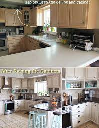
The standard distance between a countertop and upper cabinets is 18 inches. The average countertop is 36 inches high. The average base height of an upper cabinet is 54 inches off the floor which is an average eye level. Easy access from cabinets to counters makes a kitchen functional.

Kitchen design is a personal choice, but home décor experts will tell you that a kitchen’s countertops and upper cabinets are more than aesthetics. The function of both makes working and being in a kitchen less stressful and allows for creativity and ease in cooking and preparing meals. The distance between a countertop and upper cabinets is a functional choice. 

Space Between A Countertop And Upper Cabinets 

One of the fundamental desires is to create a stylish kitchen with an efficient cooking space. It’s more than just fancy units or hi-tech appliances that matter, as you can get the layout wrong. The aim of kitchen design is to create a stress-free kitchen zone. Part of this is to know how much space to leave between countertops and upper cabinets.

Tastes on displaying usable and even edible décor vary. What jumps to mind is a still-life of a prized porcelain bowl filled with fruit on a countertop. Imagine an antique milk jug and a row of glass jars with nuts and breakfast cereals. The charm of the farm- or country house is attractive but not necessarily to everyone’s taste. But how low or high cabinets are above countertops matters. 

A kitchen countertop is also a space for a fresh delivery of pastries, even a loaf of bread. Keeping a countertop decluttered can be challenging. The space between a countertop and the upper cabinets must be high enough to fit at least a bread bin and also a microwave. A countertop’s height must also allow for sufficient light from downlighters on cabinets above.

Styling A Kitchen Counter Below A Cabinet   

Countertops are known as the workhorse spaces of a kitchen and have a variety of uses. As much as our tastes differ, so do the spaces we create. Kitchens are notoriously cluttered with sieves, sifters, and even whisks hanging from upper cabinets above countertops. Or, countertops are stripped and left bare till a gadget is taken down from an upper cabinet and used.   

Toasters, kettles, and coffee machines are often stored in cabinets above or on countertops. But microwaves are used on countertops and stored below upper cabinets. Upper cabinets are designed at a convenient height to reach, take down what’s needed, and easily store back there again. The height at which an upper cabinet is fixed is in line with the height of an average person.

There are deviations in the heights of both countertops and where upper cabinets are put, especially if these are custom-designed. 

Standard Distance Between Countertop And Upper Cabinets

The average distance between a countertop and an upper cabinet can either be a standard measurement or customized. Customizing the heights can be lower or higher depending on a person’s height. But in general, the height of a countertop is a standard 36 inches. 

Beyond style, a kitchen’s function is a set of well-ordered spaces to make working there enjoyable and efficient. Efficiency is crucial for choosing the right height between countertops and upper cabinets. So more than storage, accessibility matters, and placing cabinets too high can be inconvenient. 

Countertops and upper cabinets work together. A well-ordered kitchen often puts these on at least two walls. No one will choose to do without countertops, and the convenience of upper cabinet storage is also for convenience and to keep a kitchen clutter-free. Upper cabinets are often a style feature, with glass inserts and even in-cabinet lighting. 

The following measurements are used as the distance between countertops and upper cabinets:

  • Upper cabinets fit above countertops at an average height of 18 inches
  • Open shelving above a countertop can be fixed as low as 15 inches

The lowest end of the upper cabinets is fixed at about 18 inches above a countertop. This average can also be as low as 15 inches and as high as 20 inches. The reason for this is the height of people using a kitchen. The average distance between a countertop and an upper cabinet is designed to the average height of a person, which is 5 feet 8 inches. 

Customized Counters And Cabinets 

At 18 inches, a cabinet is in line with the average height of people. This average eye-level height makes it easy for most adults to see into cabinets. They can access items and even be able to reach up for some items on higher shelves. At this height, there is no need to stand on a two- or three-step ladder. Cabinets too high are inconvenient as these are often out of reach.

The customized distance between a countertop and an upper cabinet can vary between 15 to 20 inches. This distance is in line with a homeowner’s height. The height also considers the average height of appliances stored on countertops and below cabinets. The height of upper cabinets must also be accessible as food, and lightweight kitchen implements are often stored.

Distance Between Countertops And Cabinets As Convenience 

From a design perspective, the distance between a countertop and an upper cabinet is wide enough to stop you from bumping your head. Also, the distance between the top of a counter and the base of an upper cabinet should be vertically deep enough to fit the appliances you would like to use on the counter. Often a microwave is stored and used here.

Purpose-designed kitchen cabinetry comes in various sizes. The vertical height between a countertop and an upper cabinet can be as high as 20 inches. Standard designs, preassembled, or RTA (ready-to-assemble) units’ spacing between countertops and upper cabinets are fixed.

 For many designers, these distances vary between 15 and 18 inches and up to 20 inches.

A kitchen works as well as the equipment stored in the right places. This makes a kitchen space easy to work in. Kitchens reflect homeowners’ personalities. A kitchen’s overall design stands out through the floor print of countertops and the cabinets above. 

Cabinets are convenient storage spaces and even have glass fronts as display spaces. Upper cabinets can show off a collection of premium cookware near a stove and above a countertop. Or even sets of glassware, antique crockery, and silverware. 

Additional Proportions To Consider

The distance between a countertop and upper cabinets is at least 18 inches. This distance and the proportion of the counters and the above cabinets are essential in a kitchen’s design. From a design perspective, the cabinets above are set back and project at most just over half the width of a countertop.

A cabinet’s depth is, on average, 24 inches – this also allows maximum working space on a countertop below. One of the drawbacks of having upper cabinets project too far is what designers call dead space in kitchen design. This means that there is an area at the back of a countertop under a cabinet that can be used for storage only.  

Suppose an upper cabinet is less than the average 18 inches above a countertop and has a deep overhang. In that case, the space at the back will be unusable, unattractive, and dark. It might mean that under-cabinet lighting must be installed and left on even during the day.  

Another proportion to consider, mainly on a level of visual impact, is the actual height of cabinets above a countertop. On average upper cabinets are 36 inches, but these can range from as low as 12 inches (the height of a single shelf) to 42 inches high. Upper cabinets that reach the ceiling are 48 inches high. These heights are calculated from a level 18 inches higher than a countertop.

Not Using Vertical Space

One of the common blunders in kitchen design is overlooking using vertical space, in this case, the space between a countertop and upper cabinets. This is especially so in smaller kitchens where this space is overlooked. The space between a countertop and an upper cabinet can be designed as a storage space with square baskets and even small wooden crates.

In addition, upper cabinets don’t have to have doors. Closed cabinets can be alternated with open shelving – a mix of open shelves and closed cabinets can be a design feature and be functional. 

Conclusion

Though many of the heights in a kitchen are a personal preference, the average height between a countertop and upper cabinets is a tried and tested one. Kitchen designers have found that the space between a countertop and upper cabinets is more than aesthetics. Avoid dead space to get maximum function in a kitchen.  

A kitchen countertop is more than a ledge or shelf. This space is used for modern-day gadgets as well as the preparation of meals. A well-designed countertop with adequate space underneath upper cabinets is usable. In contrast, if the space is too narrow, this becomes wasted space. In addition, if the space is too wide, the upper cabinets are too high, which is impractical and inconvenient.

Should Curtains Touch The Floor? (Answer Inside!)

How you hang your curtains can drastically change the look of a room. So, should curtains touch the floor?

Curtains should not touch the floor. It is recommended that curtain panels simply hover above the surface of your floor. This look and hanging style is called the kiss. However, there are several other hanging styles that one can pick from. These are called puddling, break panel, and floating.

Curtains not only provide privacy, but they also add texture and softness to a room. Many people are unaware that curtains, like the paint color you choose, can change your space. They also have the ability to make a space appear bigger if they are hung from floor to ceiling. It is imperative to hang them just right or choose a hanging style that works for your room and its functionality.         

Should Curtains Touch The Floor?

Suppose you’re wondering if curtains should touch the floor. In that case, the answer is no. Basically, you want to have the curtain just kiss the floor. It is typically a hard look to pull off, but it’s also the best as it gives the curtain a more polished look.

This requires you to ensure that you get your measurements incredibly accurate as the curtain panels need to be hovering perfectly on the floor’s surface. Ensuring that your curtain just kisses the floor will look the most customed, polished, and tailored. 

To get this look, people generally measure the distance from the top of the curtains all the way to the floor. One way to do this is to hang the curtains on your rod and mark where they reach while their hanging.

Modern living room interior with beautiful curtains on windowModern living room interior with beautiful curtains on window

What Other Ways Can Curtains Be Hung?

Apart from the fact that curtains should just touch the floor, there are typically several well-known ways that interior designers like to hang their curtains. Therefore, apart from the kiss look mentioned above, there are also the puddling, break puddle, and floating looks.

Hanging Your Curtains Using the Puddling Method

Puddling of a curtain never seems like a good idea as it basically looks like you bought a curtain off the shelf and never bothered to hem it. This is kind of like the equivalent of someone that is wearing pants that drag on the floor. 

Many people consider this one of the worst ways to hang a curtain, as the curtain will require frequent cleaning. However, this hanging style is typically done for a dramatic effect. To get the puddling look just right, 2 to 4 extra inches of length should be added to the floor of the curtain panels.

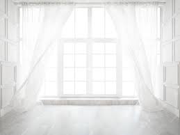
Backlit window with white curtains in empty roomBacklit window with white curtains in empty room

Hanging Your Curtains Using the Break Panel Method

Another way to hang curtains would be the break panel way. This is a somewhat in between how you would do the kiss look and the puddling look. This is because the panels don’t hang straight down or float either. 

This hanging style is usually effective at creating a dynamic effect. Furthermore, more interest is added by the break. To get this look, simply add an extra half inch to 1 inch beyond the floor to the length of your curtain. This will ensure that the curtain panel will break as it hits the floor.

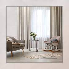
Modern room interior with armchair and curtainsModern room interior with armchair and curtains

Hanging Your Curtains Using the Floating Method

Most people have no desire to have their curtains touch the floor. If that is the case for you, an excellent hanging style would be the floating look. Simply hang them half an inch above the floor. This is one way to get a clean look. 

However, this style is often considered less formal. The curtains will also need to hang stick straight when using this style. The goal should be not to let your curtains float more than half an inch, as this will give the impression that you made a mistake when doing your measurements.

How Can You Figure Out What Curtain Length To Go For?

Figuring out the length of your curtains so it just touches the floor can be daunting, especially when you do not know where to start. However, one way to make it easier is to figure out what height your ceiling is. 

This is because the height of your ceiling will help you determine what length your curtains should be. Although different houses are built differently, and ceilings vary, a standard ceiling height tends to be roughly 8 or 9 ft. Curtains also typically come in standard sizes.

Furthermore, suppose you find yourself slightly confused about what length you’ll need for each kind of room. In that case, the first thing to do to help you figure it out is to look at the function of that particular room. Generally, you can have longer curtains if the room is more on the formal side. 

However, for informal rooms, it is best to choose curtains that are a bit more on the shorter side. This is because, typically speaking, formal rooms don’t have that much traffic, so the puddle look mentioned above would work. 

However, a room like your bedroom is more on the informal side, so it would be best to avoid longer curtains unless you desire a romantic look. In that case, the puddle look would work. Living rooms are typically just the right amount of formal and informal. This is where the kiss or float look would work best.

Modern living room. Room window with curtainsModern living room. Room window with curtains

Can You Hang Short Curtains?

There are some instances where the curtain simply wouldn’t work if hung using the kiss style. Sometimes when spring and summer come around, you may feel like there is a lot of fabric and want a lighter look and feel. Yes, curtains should mainly be hung long, but there is an exception to every rule.

The trend of long curtains is great. However, there are several places where short curtains are much more practical. Imagine walking into a bathroom that has a curtain that is hovering off of the surface of the floor. It wouldn’t look good.

Short curtains would be more appropriate for areas with something like a built-in radiator directly below the window. It would also be appropriate if you have furniture placed directly under the window simply because of the layout of the room.

Furthermore, short curtains typically tend to be used in kid rooms. This is a good idea as kids are still clumsy, and the chances of them tripping on a curtain puddling on the floor are high. Kids also generally make a mess, so shorter curtains are more likely to stay clean a little longer than long curtains would.

As mentioned above, the bathroom isn’t a space where you want a ton of fabric. This is where short curtains come in handy. The kitchen is also another place where short curtains are suitable, especially if the window is directly above a kitchen sink.

Small curtains look more chic on smaller, narrow windows. In addition, a pair of drapes will look overwhelming on a small window. These types of windows are generally found in the basement or the attic.

As you can see, curtains typically should not touch the floor. They should just barely kiss it. If you want a different style, there are several to choose from. Puddling is great for formal rooms and when you want a dramatic look. The break panel is for when you want a combination of both kiss and puddling looks. 

Floating is excellent when you don’t want puddling but also want your curtain to be just a little more elevated from the floor. Each of these looks works in different rooms and designs. Smaller curtains also have their place, as proved above. You simply need to assess the room, try out different looks, and see which one brings life to the room.

What Is The Minimum Toilet Room Size?

Even the smallest toilet room can be comfortable and functional and be a home décor accent. You, however, need to know the minimum size for a toilet room. 

The minimum size for a toilet room is 32 inches wide by 60 inches long. Designers add at least six inches to the width and length to be 36 inches by 66 inches. Wheelchair users need an extra 18 inches of toilet room length. A standard toilet room doorway is 32 inches wide.

A toilet room is a convenient space in a house, and as it’s not in a bathroom, it adds privacy. A toilet room is not a space to ignore but to use imaginatively. A toilet room can be designed as a small accent space. A separate toilet outside a bathroom can also function as a cloakroom toilet for guests. So what’s the minimum size for a toilet room?

The Minimum Size For A Toilet Room

If a home has the space, a toilet room is a sought-after feature. The enclosed space of a toilet room is convenient and private. The space can be any size, but there are industry standards for the minimum size. The industry-specific guidelines work with the relationship between the toilet as a fixture and the floor space, walls, door, and other items like a basin. 

A toilet room’s size indicates the size of the toilet you can have and the shape. The National Kitchen And Bath Association (NKBA) has a set of guidelines for the size of a toilet room that has to do with the width and length. The positioning of a toilet must relate to the size of the room. 

A toilet room’s size is at least the industry’s minimum standard – a set of guidelines on the width and length that include a toilet’s size. The toilet as a fixture must relate to the room’s walls. However, the minimum size of a toilet room must be big enough to fit a toilet and be comfortable and functional.

The industry specs for the size of a toilet room are a minimum requirement. But recommendations for the size of a toilet room can exceed these minimum standards and are dependent on what a homeowner’s needs are. In addition, the standard sizes and shapes of toilets influence the size and layout of a toilet room.  

The space will determine where a toilet is, the distance between a toilet, the room’s walls, and fixtures. The position of a toilet is crucial to allow for movement into a toilet room – entering and exiting through a door.  

Minimum Standards For A Toilet Room 

The minimum standards are a guideline for ease and comfort of moving into a toilet room. The guidelines allow one to step inside, open and close a door, and sit comfortably on a toilet seat with the door closed. A toilet room’s size and where a toilet is put depend on other fixtures, like the actual floor space and a basin, if needed. 

Toilet rooms often are in narrow spaces in a home with the least width and length as:

  • Width: 30 inches
  • Length: 60 inches 

Codes have minimum requirements to avoid having a toilet room as a camped narrow space and for ease of comfort, but the recommended size is wider—no need to think that only the rest of your house is open to your design and fancy. A toilet room can be too. Though, homeowners spend little time thinking (and possibly not dreaming) about a toilet room’s design. 

Recommended Toilet Room Width And Length

A toilet room with a width of 30 inches and a length of 60 inches is the absolute minimum size. Interior designers work with at least 6 inches more in width and length to suggest that the design of a toilet room should be at least 36 inches wide and 66 inches in length. In some cases, and depending on the space earmarked, the toilet room size can be wider (and even longer). 

According to industry codes, the minimum distance to indicate the width of a toilet room is measured from a toilet bowl’s center to a wall as 15 inches. But again, for designers, this width must be at least 18 inches from the center to a side wall. The additional 3 inches on either side gives leeway or freedom to use the toilet comfortably.

Other minimum measurements that must be taken into account when deciding on a toilet room size are the distance of the toilet from a toilet room’s back wall and also the space in front of a toilet (see below).

Toilet Back Measurements

There are other minimum measurements to consider, which have to do with the length of a toilet bowl to the length of a toilet room. The length of the toilet bowl is the actual size of the toilet bowl plus the rough-in size of the toilet – the distance between the toilet flange and the back wall.  

The rough-in measurement is essential, and often when not planned, this measurement is overlooked. The measurement is from the outlet pipe in the back wall of a toilet room to the center of a toilet drain pipe (or flange). The average length of the rough-in can vary between 10 and 12 inches but can be as long as 14 inches. 

When installing a toilet, you must consider the exact rough-in size on the backside of the toilet where the toilet tank is. This measurement indicates a toilet’s depth in terms of the overall length of a toilet room. This length plus the length of a toilet bowl to the edge of the seat in front indicates the length-way size of a toilet.

The front edge of the toilet seat is the depth at which a toilet projects into a toilet room space. 

In addition, there are different toilet bowl designs, which also affect the length measurement of a toilet (including the rough-in), like the toilet bowl shapes:

  • Round toilet bowl
  • Elongated toilet bowl

The round toilet bowls take up less space and vary between 25 to 28 inches from the wall. An elongated toilet bowl is at least 4 inches longer in size and between 29 and 31 inches. The length of a bowl in a toilet room can interfere with the opening or swing of a door.  

Toilet Front Measurements

The design of the usable space in a toilet room is primarily the toilet as a fixture and also entering and exiting a toilet space. A door can be in front of a toilet or on the side of a narrow toilet room. In both instances, the door can either open inwards (into the toilet room) or outwards (away from the toilet). How you move in this space has given homeowners space for ingenuity.

The minimum distance between the front edge of a toilet seat and a door is 21 inches, but the recommended distance is closer to 30 inches and more. One must consider the width of an inward opening standard internal door’s width between 28 – 30 inches. Of course, there are various options for doors facing a toilet, like a hinged split door.   

The NKBA codes are the least or bare minimum recommendations for the width and length of a toilet room’s size. The clearances do, however, not include space for wheelchair users. For disability access, the minimum distance in front of a toilet must be 48 inches. The additional 18 inches on the length also affects the minimum size of a toilet room if designed for disability.

Tight Toilet Rooms And An Illusion Of Space

A toilet room size in a home is often used as an accent or design feature. A toilet room doesn’t need to be downplayed as just an outhouse in a glorified position, a home. Some eccentrics have thought of a toilet as a throne! Working with a small space, like a toilet room of the bare minimum size, allows designers to be clever. 

Once function and comfort are in place, designers can play with a tight toilet room to create an illusion of space. 

Styling even the smallest toilet room can include even off-beat accents:

  • Minimalist, clean lines, neutral colors, and bare walls
  • A walled alcove with metallic tiles on the side and back of a toilet creates the illusion of width and depth
  • Backlit recessed shelve with a bonsai plant
  • Narrow horizontal slit-design window on the back wall or vertical slit window on a side wall
  • A skylight
  • Lighting along a wall as an accent and for ambiance

The toilet room size can be a coveted space and doesn’t need to be boring. You can stick to the recommended sizes (even the minimum codes) and create a space that doesn’t look like an afterthought.

Conclusion

The bare minimum regulations for the size of a toilet room are at least six inches narrower than the recommended minimum size of a toilet room. The recommended length of a toilet room is also six inches longer. Though the minimum space of a toilet room is cramped, you can use the space to create an illusion of size.

Designers work with the minimum sizes of a toilet room, design off-beat spaces, and make toilet rooms bigger and less bland or mediocre in look.  

25 Ideas to Light a Living Room With No Overhead Lighting

Many homes face the challenge of not having enough light in their living room. If your living room is missing overhead lighting, you’ll need to develop alternative solutions to get the ambiance your space needs. In this article, we will look at how to light a living room with no overhead lighting. 

These solutions will help you get the lighting your space needs while also serving as a decorative piece to give your space character and style.

Plug-In Pendant

If you want the look of a light that hangs overhead, but you don’t want to go through the hassles and expenses of having a permanent fixture installed, consider a plug-in pendant light. 

With this type of lighting, you will need to hang a hook on the ceiling, ensuring the hook has the appropriate weight support for your chosen pendant. The downside of using this method is that the pendant cord will drape down from the ceiling and must be inserted into a wall plug for power. The best look is to place this light in a corner or along a wall out of the way.

Chandelier Sconce

If you’re looking for an elegant way to get lighting without taking up valuable floor space or having to hang hooks from your ceiling, a chandelier scone could be just the ticket item for your living room. 

You can pick any style of chandelier sconce to match your living room decor. All you need is something attached to the wall to hold your light fixture. When choosing the proper location for your chandelier sconce, you will need to be sure the light sticks out far enough away from the wall. 

Battery Lights

Another choice is to use battery lights. The great thing about this type of lighting is they run on batteries rather than power, saving you money on energy bills. And because they don’t need an electrical power supply, you can hook these up yourself, saving a ton compared to having a professional electrician install new lighting. 

The downside of this style is that most battery-powered lights aren’t as powerful as standard lighting. And depending on the frequency of use, you might have to replace the batteries frequently. Of course, if you don’t use rechargeable batteries (you should!), you’ll also face the costs of replacement batteries. 

Smart Bulbs

An excellent way to control the ambiance of your room with the perfect lighting is to use smart bulbs. These lights are an inexpensive way to get unique lighting without having to use expensive equipment.

So, what do smart bulbs do? These bulbs allow you to adjust the brightness and color to meet your needs – whether it’s reading a book, entertaining friends, or watching TV. Many smart bulbs not only turn different tones but also have dimmers. 

Floor Lamp With Multiple Bulbs

Floor lamps featuring multiple bulbs are a fantastic solution for living rooms with no overhead lighting. These lamps allow you to turn on one bulb for low ambiance lighting or turn on all the bulbs for brighter lighting.

Do use caution when choosing a lamp that holds multiple lights. Many bulbs can still generate heat, making a space too hot when numerous bulbs are heating up. Also, if your lamp is near furniture, you could end up feeling the heat put off when sitting in your seat trying to relax.

Chandelier Swag Light

Swag lights are the answer to situations where you want the look of a chandelier without the hassles of running a wire to connect the light. 

Enjoy the stylish look of a chandelier dangling from your ceiling by hanging a hook and then suspending your choice of swag light. If you want to hide the cord from the light to the outlet in the wall, there are wire covers – available at all electronic stores.

Spotlight Floor Lamp

Looking for a way to light up your entire space with one light? A spotlight floor lamp is a solution you need for your living room. 

There are multiple styles of floor lamps that can create the spotlight effect while still being stylish enough to match your living room decor. Picking a soft bulb ensures the lighting isn’t too harsh. Placement should be somewhere to light up all the desired areas without shining into people’s eyes.

String Lights

String lights are becoming a common sight of jazzing up outdoor living areas. But they’re also an excellent choice for living rooms that don’t have overhead lighting. 

You can hang string lights along the wall, dangling down to give the space a dim, soft, magical feel, or place them in your windows.

Sconce

Sconces are great for living rooms where you don’t want to put anything on the ceiling but don’t want to take up floor space. These lights mount right to the wall, either hardwired into your house’s electrical or powered by plugging into a wall outlet.

This lighting type comes in a wide range of styles, including some options with a built-in table. Scones are the perfect addition to living rooms due to their versatile style and use.

Uplights

Picking a lighting fixture that classifies as an uplight means that your lamp will direct light upwards from the bulb, rather than downwards, as ceiling lights do. 

Picking an uplight gives your room plenty of light and brightness, not to mention suburb style. You have a wide range of styles, from a large floor uplight or something space-saving, like a small table uplight.

Natural Light

Many people forget the best lighting source (during the day) by opening up the curtains and letting natural light shine through the windows. If you want to keep your curtains closed, look for light and thin types to allow in the most light.

In terms of expenses, natural light is the cheapest way to brighten up your living room. But you will need to consider alternative lighting solutions for times when it’s dark, preventing adequate lighting.  

Desk Lamps

If you have multiple areas within the living room that need lighting, desk lamps might be your lighting mate. This lamp style is smaller, saving space while fitting into areas where a table or floor lamp can’t.

Some suitable places to use desk lamps include fireplace mantels, desks, end tables, console tables, or entertainment centers.

Reflective Bowls And Vases

An excellent way to get the illusion of more light in your living room when you don’t have overhead lighting is to pick the proper decor pieces. 

Items with reflective surfaces can help bounce light around, making the room look brighter and directing light into areas with no light source. Bowls, vases, and lamps are great accessories to pick for more reflectivity.

LED Strips

LED strips are a fun, creative way to add lighting to your living room. These plastic strips have adhesive that allows them to stick to a surface, with a built-in button to turn them on or off. Some models have a remote.

You can pick strips with clear bulbs if you want standard lighting. Or you can find strips with bulbs in different colors. These types often have a variety of light patterns for colorful displays of lights. 

Floor Lamp With No Shade

If you want the most amount of light possible, consider a floor lamp, sans shade. Leaving the shade off gives you the total brightness of the bulb in all directions. Lamps with a shade direct the light downward and block the bulb’s full light effect.  

When using a lamp with no shade, you may want to give significant consideration to the style to ensure you pick a light that will look right in your space.

Hanging Edison Bulb

For an industrial or minimalist aesthetic, check out the stylish simplicity of a hanging Edison bulb. This style consists of the light bulb hanging from the cord, exposed – no fixture to hide it. 

Edison lights are similar to swag lights in that you hang this light from the ceiling and drape the cord down to plug into a wall outlet. This type of bulb gives you maximum light coverage, making it perfect for situations where you want a bright space.

Arc Lamps

A stylish way to brighten up your living room is to use arc lamps. These lights have long, tall stands that arc over to provide overhead lighting.

The exceptional height ensures there’s no risk of anyone hitting their heads when walking by. And the graceful curve gives any space a touch of elegance.  

Floor Lamp

Floor lamps are great for making a space feel cozy and well-lit. These lamps have a base that rests on the ground with a tall stand that elevates the light. 

You can find floor lamps in many styles, sizes, and materials, giving you plenty of choices. The most important thing to consider when using floor lamps is placement. Most lights will look best nestled into corners.

Tree Lamp

Tree lamps also rest on the ground with long stands like floor lamps. But the design of all tree lamps consists of multiple branches holding light fixtures. 

This style of lamp gives you the advantage of having light spread out, providing more coverage. But if you have limited space, a tree lamp might dominate the area. 

Pair of Table Lamps

An easy way to add a bit of dimension and contrast to your room using lighting is to use a pair of table lamps in different sizes on a large table. 

You can go with lamps that match or choose two different styles that complement each other while not matching. 

Flameless Candle Displays

Candlelight is an excellent choice for a cozy, dim ambiance. And with the vast selection available for candle displays, you have unlimited options regarding styles, materials, and the number of candles it will hold. 

Some displays will go well on tables or mantles, but you can also find wall-mounted kinds. Picking LED flameless candles gives you the nuance without the hassles and fire hazards of having multiple flames lit at once. You can even find some flameless candles that operate by remote control.

Window String Lighting

If you’re looking for a fun, unique way to give your room extra light without having it directed overhead, consider adding string lights to your windows. 

These twinkling lights give a sparkly illumination that’s perfect for reading, taking pictures, or watching TV without being too bright and distracting. 

Hanging Pendants

There are numerous styles of hanging pendants that you can use as an alternative to installing overhead lighting. However, hanging pendant light from the ceiling is the next best thing to the real deal. 

Similar to other lights we’ve discussed, you can hang a pendant light from a hook installed in the ceiling. You will need to reach the outlet with the cord, which may limit your light’s positioning. 

Wall Lights

Wall lights are a great alternative to overhead lighting. If you don’t have any already installed, you can pick up some wall lights that plug into an outlet. 

While you could add wall lights to all four walls to get light in all areas, doing so may cause the style to clash—instead, pair wall lights with another lighting, like floor or table lamps. 

Mirror With Light

Mirrors are a great way to give your area more light without having to use additional lighting sources. Placing a decorative mirror near a lighting source like a lamp or windows will help reflect the light, making space look brighter. 

Another option is to pick a mirror with lights built-in or attached to it. Using LED strips to form a border is a stylish and easy way to get more light coverage.

Conclusion

If you don’t have overhead lighting in your living room, there are multiple things you can do to give your room alternative sources that work just as well. We’ve given you 21 ways for how to light a living room with no overhead lighting. No matter your room’s space, nuance, or needs, you’re sure to find a style that works for you on this list.

How to Choose Gray Paint & Accent Colors for Your Rooms

Many people underestimate the elegance and attractiveness of using gray paint to decorate your space. Picking the right shade of gray with complementary accent colors doesn’t have to be a difficult decision. 

This guide will look at how to choose gray paint and accent colors, including different ways to create an eye-catching grey accent wall for your room. We’ll look at accent wall ideas, how to pick out the proper color of gray, complementing colors, and lighting. 

Gray Accent Wall Ideas

An accent wall is an easy and effective way to give your room style and a strong focal point that’s highly cost-effective. 

Gray is a fantastic color for accent walls because it comes in many different shades with various hues. Here are some excellent ways to create a gray accent wall that will make a statement.

Simple Single Color

You can make an effortless statement piece by painting one wall gray while using a different color for the remaining three walls. 

A great way to make an accent wall that pops is to paint one wall a darker shade of gray to break up a room with lighter shades for the other three walls, such as white or light cream. 

Gray can also be a neutral color accent wall for most color palettes, allowing for easier redecorating using room accents. 

Paint three walls a soft gray and give your accent wall a bright pop of color that matches the colors of your room, including rugs, furniture, and pillows. 

Gray Pattern

Another way to jazz up your space for a low price is to give your walls a pattern. You can buy gray wallpaper that has a design already printed on it. Or you can get creative and make a pattern using painter’s tape and paint. 

Pair your patterned wall with solid curtains for a complete design. We cover 31 types of curtains and their uses here.

Add Texture

Upgrade your accent wall by making it textured. A textured wall is more visually appealing and breaks up the monotony of having all your walls look the same. 

There are multiple ways to add texture to your wall. You can leave three walls smooth while texturing an accent wall or texture all four walls using plaster and tools. Check out this link for 21 types of wall textures you can use for your home design. 

Typical textures you can DIY for an accent wall for low costs and minimal materials or experience include:

  •  Comb
  • Sand Swirl
  • Stomp brush
  • Spanish Lace
  • Spray sand

Gray Painted Wood

Another excellent way to make an accent wall is using wood paneling painted gray. Many people hate the look of old wood paneling and want to give it a modern update, saving you money by not replacing the material with new walling. 

But you’re not limited to only painting wood paneling. You can also make a wood accent wall using reclaimed, barn, or new slat wood. Reclaimed walls look great when painted different shades of gray with a few pieces of blue slats.

How to Choose the Right Grey Paint

Due to the wide range of gray paint colors, it can be tricky to find a shade of gray that works for your room. Follow these tips for how to choose the right gray paint. 

  1. View various paint swatches in your home. Because many factors will affect how a paint color looks in your home, it’s a great idea to collect multiple swatches for an in-home comparison. Choose samples of cool and warm shades and see how the colors look in your chosen room in different lighting – natural light (different times of day), at night, and with the lights on in your room. Be sure to compare different shades next to each other and items in your room to ensure the undertones of the paint match your decor. 
  2. Use paint samples of your color choices. Once you’ve narrowed down your paint choices to three or four colors, it’s time to compare how each shade looks in your room. Pick up paint samples of each color and apply the paint to your walls. If you don’t want to paint your walls with the sample colors, you can use a white poster board with a flat finish, white foam core, or white sample boards. The color of your wall can change the color of the sample paint. Label each color and add two or three coats for each shade. 
  3. Compare each shade of paint in different lighting situations. If you’re using sample boards of paint, secure each piece to the wall with painter’s tape. Check the colors throughout the day – morning light, mid-day light, late afternoon, dusk, and night. You should also see how each color looks in artificial light and with artificial and natural. 

Colors that Compliment Grey

Gray is a versatile color that can blend well with many different colors and design palettes. There are multiple shades of gray with varying undertones of color, which will affect the way your paint appears. 

When looking at one gray shade, it may be difficult to detect the different undertones. The best course of action is to compare two or more grays side by side. This process will help you notice the color blends of the gray, allowing you to make a better design decision. 

There are gray paints mixed with undertones of charcoal, purple, lavender, yellow, brown, red, green, blue, or gray-blue. Match the proper undertones with the appropriate shade of gray to get a cohesive look with your flooring and existing furniture and design accents. 

  • Lavender hues – feminine and soft
  • Green or blue hues – neutral 
  • Red or brown hues – warmer 
  • Silver hues – turns blue
  • Cool grays – great for kitchens with stainless steel appliances

To decorate a space that feels too cool, choose complementary colors for your trim and use warm wood accents or furniture. For instance, if you have a gray area with black accents, caramel, and warm white blend well. 

Accent Shade Undertones for Gray Paint
Red Blue/Emerald Green
Orange Blue
Yellow Royal purple/Blue
Royal purple/Blue Yellow
Magenta Kelly green (or other bright greens)
Purple Green/Chartreuse yellow
Green/Chartreuse Yellow Purple
Blue Orange
Kelly/bright greens Magenta
Blue/Emerald Green Red

The above chart can help you match the proper shade of gray with your room’s design palette and accent colors. However, if you’re using softer accent shades, the chart won’t help. 

Creating a softer environment is achievable by choosing a shade of gray that has the same color undertones as your accent colors. 

As an example, for yellow accent colors, pick a gray that has yellowish undertones. If your yellow color features green undertones, match with a gray shade with similar green or yellow hues.

Lighting

The lighting in your space is a crucial consideration. Different lighting situations can affect the way your gray walls appear. And you can’t base your decision on how a color looks using a color chart. 

It’s best to purchase two to three samples of your chosen shade of gray and paint small patches on your wall. Be sure to use an area where there are varying degrees of lighting.

Natural Light

To make the best decision, compare how the different paint samples look with natural light. A bunch of windows can add too much sunlight to the area, washing out your gray colors. See how each shade of gray looks in natural light at different times of day to know how your chosen colors will fare.

North Facing Rooms

Rooms with windows facing North will notice the gray colors taking on a bluish hue. These rooms can be the most challenging to decorate. Cool northern light gives some gray shades a flat, icy tone.

To give your room more warmth, consider dark shades. Choosing grays with brown or red undertones is excellent for warming up space without overwhelming it with unsuitable colors. 

Strong color choices for Northern rooms include charcoal gray, which is great for dining rooms due to its dramatic, glamorous look. Grays mixed with beige or yellow bases – greige – are great for bouncing light through the area to warm the different shades of gray. 

Grays with blue or green accents will be the least complementary colors for North-facing rooms, as the tones can make your space feel cold and uninviting. 

If you decide you want a blue-gray color, you’ll need to use proper lighting – wall sconces or floor lamps. Using only overhead lighting can cause shadows. Layered lighting works best. 

West Facing Rooms

Rooms that face west will experience changing hues of gray, with warmer tones as the sun sets and cooler tones as the sunrise.

Due to the frequent sun exposure, grays with hues of yellow or beige will have the best tones and warmth, drawing in sunlight throughout the day for the warmest tones during the evening. Yellow hints can create a cozy, inviting space. If your room gets little light, you’ll do best with warm, light gray colors. 

South Facing Rooms

South-facing windows and rooms get to enjoy a warmer ambiance that lights up the gray with golden hues. These spaces are the easiest to decorate because you can choose from cool or warm grays – any tone will look fantastic with southern lighting. 

To create a spacious, bright room, warm grays or pale tones will be your perfect color palette. 

Eastern Facing Rooms

East-facing rooms experience the same changing tones as West-facing windows. During the sunrise, rooms facing east will experience warmer tones. As the sun changes positions, the lighting will cause gray colors to have cooler tones. 

Eastern light can cause gray paint to have bluish undertones. Many designers advise going with the design and choose blue-gray or green grays. French gray is an excellent shade for Eastern rooms. Green-based blues are the easiest to blend with different colors or wood tones due to their neutrality. 

For cooler climates, you’ll want to use grays in layers of colors to prevent your space from looking too cool or clinical. Warm the room up further by using warm accent colors, natural wood, and warm metals.

Grey Accent Wall Painting Tips

Flat paint looks best on gray painted walls.

Gray can be a tricky color to work with because you can end up with a space that’s too cold and uninviting. Or you can end up making your area look too industrial and commercial, rather than an inviting, welcoming space. 

The type of finish your paint has can affect your design’s ambiance. Semi and high-gloss gray colors tend to look more industrial and uninviting for a living space. 

To give your room a comforting, welcoming ambiance, choose flat gray paint. Flat paints have less sheen, making them easier to hide smudges and flaws.

Gray painted walls – Cream trim.

Depending on the shade of gray you choose, white trim may give your space enough character. But if you think a white border will cause the area to look too stark, consider using warmer toned colors. 

Cream, yellow, red, or brown paints mix well with white to create an even, warm color balance for your space. 

Invest in sample pots of your colors and paint test squares.

When debating between different shades of gray for your area, you shouldn’t just pick a random shade from a paint sample strip at your hardware store. 

To ensure that you get a gray paint color that enhances the design and appeal of your space, test different shades of gray on your wall. 

Most places have sample pots – small containers of paint – which allow you to test different colors in your space without wasting money on an entire can of paint. 

For the best results, pick up a few different shades of paint samples. And then paint a small square for each shade, making sure the colors are side by side for easier comparison. It’s a smart idea to label each color, so you don’t forget which is which. 

Wait a day or two before making your decision on color. During the consideration phase, take time to see how each shade of gray looks in different lighting throughout the day. 

You may decide to paint squares on each wall of the room to ensure you know how the colors will look in the darkest areas of the room and the brightest parts. 

You may also want to see how each color looks against your room’s trim. If you decide you like a shade of gray but it doesn’t go with your trim, there’s always the option to redo the edge after you’ve got the walls painted.

Let your painted walls sit for at least a day.

As we mentioned above, you should wait a day or two (or even three or four) before deciding on a shade of gray. 

Paint colors can look different when they’re wet compared to when they dry. It’s best to wait until the paint is no longer wet before picking a color you like. A gray may have a darker tone while wet that lightens once the paint dries. 

Once the paint is dry, examine the colors during different times of the day (and night). You may also want to wait until a rainy, overcast day to see how your paint color looks when there’s no sunlight. Some grays can end up looking too gloomy on days when it’s nasty outside. 

Remove paint colors you don’t love.

Once you’ve painted your walls with test colors, you may instantly find shades that you don’t like. Put the samples away or toss them if you don’t think you’ll want to paint other spaces gray later on. You may also want to mark the colors off on the wall. 

If you’re struggling to decide which color would work best in the space, try painting a more prominent area rather than a small square. Sometimes, it helps to see things on a bigger scale. 

Work out your color scheme and vision for your room. Then decide on a shade.

Some people may prefer to figure out their room’s desired design and color palette. If your space already has color accents, you may want to find a shade of gray that blends well with the existing scheme. 

But if you’re doing a complete redesign (or original design for a new build), you may not yet have design features or know what colors you want to use for your space. Making plans for your room, including picking out your desired color scheme, should happen before you pick a shade of gray for your walls. 

Because gray comes in so many different undertones, these blended shades may end up clashing with your room’s aesthetic. Clashing colors can throw off your room’s entire design. 

Bathrooms can look great using light, cool blue-gray colors. For spaces that have dark grays, consider design accents like brown furniture to add warmth. Some accent colors can cause your gray paint to appear white.

Even if you don’t have an idea of your room’s entire design, you’ll save time and have easier decision-making by choosing a single inspirational piece on which to base your color choices. 

You can use furniture, lamps, throw pillows, carpets, area rugs, trim, or even outside items like wrapping paper or clothing. After picking a piece that gives you color ideas, choose a gray that has matching undertones. 

Conclusion

As this article demonstrated, gray paint is a versatile color that comes in different shades with varying undertones. Because gray can be a neutral color, it can go with many designs and complement other colors. We’ve explained how to choose the right color of gray and what accent shades match. Happy decorating.

25 Creative Front Door Decor Ideas

Nothing draws the eye to the front of your house better than having front door decor. In this article, we’re going to look at 25 ways to decorate your front door creatively. We’ll also look at some accent pieces that complement the front door, giving you plenty of ideas to create a welcoming entrance. Many of these are easy DIY projects that you can do for minimal costs.

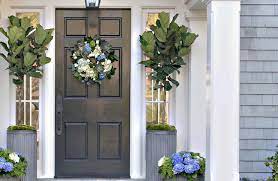
Wreaths

The easiest way to decorate your front door is to use a wreath. Once limited to Christmas, now wreaths are fantastic accessories for the changing seasons. You can also use wreaths to decorate for Thanksgiving, St. Patrick’s Day, Mardi Gras, Easter, the 4th of July, New Year’s, Veteran’s and Memorial Day, and Halloween.

Are you not looking to redecorate every few weeks? Try a simple greenery wreath with a monogram centerpiece. This option is a fantastic DIY project that requires minimal skill or effort. 

Hanging Flower Basket

If you’re not a fan of wreaths or prefer something that grows, consider a hanging flower basket. This option is fantastic for people with a green thumb who want to give their guests something beautiful to see (and smell). 

But if you want the look but can’t keep a cactus alive, consider using artificial (faux) flowers. Change your flower colors out to match the seasons. Hanging a few baskets around the porch can also help improve the aesthetic of your front entrance.

Planters

Planters are a great way to spruce up a tight entryway where there’s little space on either side of the door. Fill planters with small trees, flowers, or climbing vines that will wind up the side of your house for dynamic beauty. Choose colored or designed pots for more style. 

Planters come in many shapes, colors, and decorations, allowing you to find a style that matches your preferred decor. Small trees and vines are suitable for people who have minimal spare time to groom and care for flowers. Rose bushes are also an attractive choice.

Doormats

Some people pay attention to the doormat that sits outside your front door. Others may never think to look down. Either way, doormats are an easy way to welcome guests to your home while keeping your floors clean. 

You can keep it classic with a simple “Welcome” or personalize it with your family name. In contrast, some people like to use humorous sayings or to warn of pets. If you’re a sports fanatic, you may want to represent your team. Or change out the mats to go with the holidays for an easy way to redecorate. 

Address Plaques and Numbers

An understated elegant way to decorate your front door is to add an address plaque with the numbers for your address. If you have space above your door, you can mount a decorative address plaque to hide the gap.

Or you can mount the plate or use individual numbers placed right onto your door. The main factor to consider is size – too big is distracting while too small is hard to see. Some people may decide to hang an address plaque on the wall or near a mailbox mounted on the wall.

Without an easy way to identify your address, you may end up with lost visitors, missed deliveries, and difficulty with parties or large gatherings.

Signs

Signs are a great way to greet visitors. And it’s easy to swap out for the different holidays, allowing for simple, creative decor that’s quite affordable. You can DIY paint your signs, or you can purchase them just about anywhere, in any size or design. A tall welcome sign propped up is helpful for doors that won’t look right with something hanging on the front. 

You have the option to choose any style or design of the sign, saying anything you want. Show off your family pride with a sign bearing your name. Announce your team affiliation in a particular sport, warn away trespassers, welcome friends, or do something entirely humorous. 

Sconces

Sconces are a great way to give your outdoor area appeal while being functional and lighting up the space. You can find scones in various styles, from mid-century modern to farmhouse or glam. 

When scones are placed on each side of the door, the light highlights the space, giving a safe, warm feeling. Your guests will feel protected when standing on your porch, waiting for you to answer. If you have an outdoor security camera, scones make it easy to see who’s on your porch after dark, and you have plenty of light if you’re trying to find the right key to unlock your door.

Pendant Lights

Does your front door area only have one light fixture installed overhead? You can jazz your space up by choosing an outdoor pendant light. These lights extend down from the ceiling, giving your area style and appeal (and practical lighting). 

You can find pendant lights in multiple styles, allowing you to find a light style that goes with any aesthetic design. Whether you want rustic, modern, country, contemporary, or unique, a single pendant light can give your space an easy makeover. But always make sure that you choose outdoor (exterior) lighting rather than the interior. 

Welcoming Sign

Or welcome guests to your home by hanging up a cute welcome sign. Many people like to match their sign to their home color scheme. You can get crafty and make a unique design for your home or buy one already made. Hobby stores are great for buying all the pieces needed to make your own. 

You can hang welcome signs on your door, on the exterior wall on one or both sides of the door, or above your doorframe. 

Seasonal Decor

Many homeowners decorate their exterior space with seasonal items. Changing the look allows for your home to look current and appealing, rather than unattended and dated. When it comes to holiday decorating, there are no rules except go with what you love. As we said earlier, wreaths and signs are easy ways to decorate for different holidays.

Choose flowers, signs, and other decors to go with whatever is in season. Pink goes excellent for Valentine’s Day, green for Christmas or St. Patty’s Day, orange and red for fall, red, white, and blue for National holidays.

Mail Slot

Does your door have a mail slot, functional or non? If so, giving your mail slot a vintage makeover is a great way to give your door appeal and style. You can even find faux mail slots so you can have a look without the risk of unwanted bug entry.

Mail slots are a great way to keep an older house looking authentic or to give a new home class and an old-world feel. You can find many different styles, colors, and material options. 

Kick Plate

Kick plates are another decor occasionally used by homeowners who want to give their front door a subtle pop of style. If you’re not keen on the idea of mounting a permanent kick plate, consider a magnetic or adhesive option in the same finish as the door handle. 

Suitable color choices for kick plates include using brushed nickel kick plates for dark blue or black doors; oil rubbed bronze with white, or gold with pastels. For people who are unfamiliar, a kick plate is a metal plate that extends the width of the bottom of the door. This plate offers protection from the door being pushed open with your foot. 

Script Decals

Does your family have a motto? Or do you want to impart words of wisdom or love to those who come through your front door? Consider using script decals. You can find many sayings and designs, or you can create your own using a vinyl machine. The best thing about decals is that they’re removable, so there’s no leftover damage once you take them off.

This type of decor is the best for renters who can’t make significant permanent changes to the design of the space but want a fun and easy way to make space their own. Whether you own a home, live in an apartment, a dorm, or you’re subletting a condo, script decals can be your best friend for easy (and seasonal) front door decor.

Storm Door

A storm door, known to some as a screen door, is a fantabulous way to enjoy a room bathed in natural sunlight with an open door, without the risk of bugs, lost air, and noise from outside. You can choose something simple, like a solid glass front, one with two halves that open with screens, or those with decorative accents or bold colors.

These doors allow you to keep your front door open. The metal frame, housing sheets of glass, offers a barrier between indoors and outside. It’s a great solution if you need to keep an eye on what’s happening in front of your house, such as watching for the Amazon or FedEx truck or for your kids to get off the bus.

Lantern Display

Light up the area while brightening up the style by using a group of lanterns of different heights, arranged together in an eye-catching display. 

You can use three to five lanterns placed opposite the door side with the hinges. Flameless candles are great for safety and lighting or buy lanterns with lights already built-in. Choose old, antique black metal lanterns for an old-timey feel or look for more up-to-date options, using more exciting materials like woven wicker baskets. 

Decorative Doorbell Cover

While upgrading your front door decor, don’t forget about all the space around the area, such as the doorbell cover. Updating this space using a pretty cover is an easy way to improve the room’s aesthetic instantly. Add a decorative planter opposite the doorbell for a finished makeover.

Even if your doorbell is non-functional, you can still make it look pretty. You can even use decorative doorbell covers for modern doorbells with a speaker or video functions. 

Upgraded Hardware

When doing all of your decor updates, don’t forget to upgrade your hardware. You don’t have to stick with a standard (rather dull) design with the wide variety out there. You’d be surprised at how such a small change can have a significant impact. 

Hardware includes your door knob or handle, deadbolt lock, and any other gear on your doors. You can choose from a range of colors, from natural or galvanized metal, copper, or zinc. 

Door Knockers

Many people forgo a door knocker for a doorbell, which can be more practical, if not as visually appealing. But just because guests may not use the door knocker doesn’t mean you shouldn’t give them a great one to look at anyway. 

Who knows? Maybe the design you pick inspires them to give it a knock – modern, traditional, engraved, animals: the list goes on. Get as creative as you want with your design.

Mounted Shutters

Mounted shutters are a simple yet effective way to highlight your front door. Naturally, you’d want to choose tall shutters that are about the height of your door, rather than selecting small shutters like what goes on your windows. This option requires minimal work and blends well with the rest of your house when matched with the rest of your shutters.

Decorative Window Film

Need a way to block a large window so you can have privacy without losing the light source? Decorative window film might be the solution you need. These films come in many styles, such as floral, geometric, frosted, or stained glass. 

Window film is an easy way to give your front door an inexpensive, easy upgrade without any professional experience for installation. 

Spot to Sit

Adding a single chair with a decorative pillow will be enough to provide a homey, put-together look that will stand out and appeal to guests. Get stylish with the type of chair you pick, and swap out the throw pillows to go with the rest of your seasonal decor. 

Got a bigger porch space? Add two rocking chairs with a small table in the middle. Or add a bench with a small runner rug and some matching colored throw pillows. 

Conclusion 

There are plenty of ways to liven up space around your front door. Since the front door is the main entry point for most homes, it makes sense that you want the area to look great and feel inviting and welcoming. You may even want to have it set up to redecorate for the different seasons and holidays which requires little effort or work. 

Six Best Front Door Colors For A Gray House

The best way to create a good impression of your home is to choose a beautiful front door that will enhance the color and design of your house. What are the best front door colors for a gray house?

The best door colors for a gray house are navy, white, green, orange, black, and burgundy. These lovely door colors paired with gray will create a stunning entrance to any home. Choose door colors that will enhance a gray house’s beauty and offer visitors an inviting ambiance.

A beautiful front door is an asset to any home and choosing the right color is essential. Below are six of the best front door colors for a gray house.

Choosing The Best Front Door Color For A Gray House

Be selective when choosing the best color for the front door of your house. This will be the first impression that guests will have when they enter your home. The door color should be an expression of your personality. It should be an inviting indication of the style and décor within your home’s interior.

You could make a bold statement or opt for a more toned-down and neutral color. Whatever color you choose must match perfectly with your exterior gray walls. Below are some gorgeous colors for the front door to enhance a gray-colored house.

Navy Door For A Light Gray House

Navy is a beautiful dramatic color and, when paired with the softer shade of light gray, creates a gentle color combination.

This gorgeous navy front door is framed by stark white panels, which creates a stunning and bold effect. The softer shade of the pale gray walls tones down the stark contrast of the navy and white and brings warmth to the palette. Adding bright yellow to the mix gives the look a splash of color and added warmth. This is the perfect way to boldly welcome guests to your home.

White Door For A Dark Gray House

The neutral shade of white is one of the best colors to pair with gray. This combination creates a classy and stylish look that is timeless.

A beautiful white front door stands elegant and regal against the warm color of dark gray walls. And although these colors are both neutral, they still put on a stunning show. Paint the window frames and trim white to enhance the color combination. Also, choose a light gray flooring for your front porch. Classic simplicity that still makes a statement!

Green Door For A Gray House

Choose an apple-green door for your gray house for a fresh look with a splash of color. Green is associated with nature and will perk up the more subdued shade of gray. It will look cool and inviting in the summer and add color to the drabness of a winter day.

green door old buildinggreen door old building

This lovely apple-green front door brings an exciting and enticing look to the home. The gray stone walls create a subdued yet homely feel. You can add lovely potted plants on the sides of the door to enhance the green color of nature. With this color combination, you can create a stunning first view of your home.

Orange Door For A Deep Gray House

An orange door will bring a fun element to a gray house. Pairing subdued gray with gregarious orange is a combination that will blend together perfectly. The gray walls add style and provide a perfectly soothing backdrop to the dashing orange door.

This gorgeous orange door makes a bold statement, and the dark gray walls are the perfect color to tone down bright colors. The light gray pots, ornament, and paved flooring in a lighter shade of gray blend in beautifully with the orange and is a lovely contrast against the dark walls. The green plants bring the soothing effect of nature to complete a stunning entrance to this beautiful home.

Black Door For Pale Gray House

A black door brings a feeling of elegance and chic to a home. When paired with gray walls, this color combination is modern and sophisticated.

The bold black door framed by the lighter gray walls makes a solid and bold statement. These colors bring a stately feel to the home, making it look luxurious and elegant. The tall potted plants that frame the door are beautiful enhancements to the beauty of a black door.

Burgundy Door For A Gray House

Burgundy is a rich reddish-brown color like the hue of fine French wine. This cool color pairs beautifully with dark or light gray and will bring a chic look to your home.

The stunning burgundy front door, framed by white trim and soft gray walls, makes a bold statement. The lovely white light fittings and the burgundy-colored wooden furniture enhance the front door’s color. The stunning combination of burgundy, gray, and white creates a welcoming ambiance on this lovely wide front porch.

Conclusion

Choosing a lovely color for the front door to complement a gray house is essential for creating a welcoming feel for visitors to your home. Colors that pair well with gray are navy, white, green, orange, black, and burgundy.

How To Fix A Peeling Faux Leather Couch

If you have a faux leather couch, you know it can be hard to maintain, and the faux leather will peel at some point. Have you ever considered how to fix a peeling faux leather couch? If you have, read on to find out more.

There are many methods you can fix a peeling faux leather couch, including using interior latex paint or using a vinyl repair kit you can buy online or at an upholstery store. There are leather fillers you can buy to fill in the peeled areas and sand the repaired areas down until it’s smooth.

The most important room in a home is the living room, and the centerpiece is the couch. It can be discouraging to see your faux leather couch begin to crack and peel. We will look at how to fix a peeling faux leather couch in more detail so you can restore your couch in no time.

Fixing A Peeling Faux Leather Couch

For most people, buying a genuine leather couch is a goal, but they are expensive, so they buy a faux leather couch that looks great instead. After some time has passed, it will start to peel, so it’s important to know how to fix it. Here are some of the most helpful and successful methods.

Preparing Faux Leather Couch Before Fixing It

Before you can start repairing your faux leather couch is to prepare the peeling surface. You should use a vacuum to remove any debris, dust, or hair that might get stuck in the paint. Then you can remove all the loose pieces of faux leather from the couch.

You can do this by peeling them off or using small nail scissors to cut them off. Be careful not to cut the parts still attached to the couch, as it might cause more damage. To remove any tiny loose pieces at the edge, you can use a piece of fine sandpaper or an abrasive pad and lightly sand them off (use only enough pressure to remove all the edges).

Lastly, vacuum or sweep up all the big and small pieces of faux leather you have removed. Then take rubbing alcohol on a clean cloth and lightly wipe the couch clean. Avoid using too much, or it might dry out the faux leather. This step mainly cleans off any oils or stains that might stop the paint, repair kit leather filler, or glue from adhering properly.

Using Interior Latex Paint

You can use interior latex paint to repair a peeling faux leather couch. The latex creates a pliable, stretchy surface that will move and form around those sitting on the couch as the faux leather does. Buy good quality paint if you want the latex paint to last longer on your couch.

You can order latex paint in the same shade as your couch online or in an upholstery store. You might get a better selection of colors if you go to an upholstery store, or you can buy different colors or shades and mix it to get the shade of your couch.

Here are the items you will need to repair your peeling faux leather couch using latex paint and the steps you can follow.

  • Latex paint
  • A leather binder
  • Leather conditioner
  • Small paintbrush or small roller
  • Fine grit sanding paper or abrasive pad
  • Clean cloth

Step 1 – Applying The Binder

In this step, you need to apply the binder to the couch areas you are repainting. It will help the paint adhere more securely to the couch fibers. It also strengthens the fibers, so you won’t need to redo the entire process again in a few months. Apply two light coats of the binder, waiting for the first coat to dry before adding a second coat.

Step 2 –  Applying The Latex Paint

You are now ready to paint the couch. It works best if you start at the back of the couch, dip the small paintbrush into the latex paint, and apply it to the couch. It’s vital to pay special attention to the seams of the couch so you end up with a seamless look when it’s dry.

If you find the paintbrush makes unattractive streaks, you can opt for a small roller instead, as it applies the paint more evenly.

Step 3 – Sanding The Repaired Areas

After letting the paint dry completely (it could take a few hours), you need to use a piece of fine grit sanding paper or an abrasive pad to smooth the areas you have painted. You may see that the sanding will reveal some of the backing material under the faux leather, but that is normal; it’s a part of the process. Be careful and avoid over-sanding the painted areas.

Use a cloth to remove the dust from the sanding and add another layer of leather binder to the painted and sanded areas.

Step 4 – Repeat The Steps

After the leather binder is dry, add another coat of paint to the couch. You must repeat steps 2-3 at least four times, remembering to wait between coats for the latex to dry completely before sanding and adding the leather binder.

The number of coats you have to apply will depend on how severely the couch surface is damaged. You should repeat these steps until you have a smooth surface that looks seamless and fits in with the rest of the couch.

Step 5 – Finish The Job

After adding the last coat of paint, you must not sand it as this is the top coat. When it has dried completely, you must use a leather conditioner on the whole couch. You can use a paste wax conditioner as well. The conditioner helps smooth out the paint and prevents it from getting sticky.

You use a clean cloth to add the conditioner to the couch and wait around 25 min for it to absorb into the couch. Then buff the couch’s surface with a dry cloth until the surface is shiny and the conditioner has blended with the couch.

Using Fabric And Vinyl Spray Paint

If you don’t want to use latex paint, you can use fabric and vinyl spray instead. There are only a few differences when you use this product instead of the paint. You use the same preparation method as you would with all the other methods.

Before spray painting, you may want to lay a tarp under the couch to protect the floor from the spray paint and add a primer like Gesso before spray painting (it may take up to a day for the primer to dry).

Once it has, you can follow steps 2-3, add a few layers of spray paint, and use the primer instead of the leather binder until you have a smooth surface; then follow step 5 and use the leather conditioner to protect the couch.

Using A Vinyl Repair Kit

If you have opted to use a vinyl repair kit instead of latex paint, this section is for you. Some kits say leather and vinyl repair kits, which are fine to use on faux leather. These kits are easy to buy online or in fabric stores, but the colors are limited.

The kits usually come with patches, a binder, filler, a cleaning solution, a stiff paintbrush, and the colorant. Some kits don’t come with a paintbrush, so you need to buy a small paintbrush.

Remember to prepare the couch before you start using the repair kit, as mentioned in the second section of this post. If you don’t prepare the couch, the repairs won’t last and won’t look good.

Here are the supplies you will need, followed by steps you can take to use the vinyl repair kit.

  • The vinyl repair kit or two if you have more than one couch to repair,
  • Small paintbrush or roller (if it’s not included),
  • Clean cloth,
  • Hot iron as these kits set using heat,

Step 1 – Mixing The Colors

In the repair kit, you will find the colors you need to mix to get the same color as your couch. If there are no empty mixing containers, use a small dish or plastic container you can throw away when you’re done. Most kits have a color mixing chart to help you get as close to your couch color as possible.

Step 2 – Painting The Peeled Areas

Next, you use the paintbrush to apply the paint you mixed to the peeled areas. Ensure that you overlap the paint on the edges by a few millimeters to help the repair seal better.

Step 3 – Use The Relief Paper

If your kit comes with textured relief paper, you can use it to give the repair a similar texture to that of your couch, so it blends in better. You could skip this step if your kit did not come with this textured paper.

Step 4 – Heat The Area

Most of these kits are heat-sealed, and you will need a small iron or heating tool to seal the repair to the couch. A heating tool works best as it has a small (so manageable) flat disc-shaped end that you can heat using an iron. If you only have an iron, set it to cotton (no steam setting).

Press the heat tool against the textured paper to engrain the texture onto the couch and seal the repair. Move the tool around to distribute the heat evenly over the repair. If you use an iron, only use the tip of the iron and lift the remaining part of the iron away from the couch.

Step 5 – Repeat If Needed

After you are done, slowly peel the textured paper away and check the repair; if the damage still shows, you can repeat steps 2-4 until you are happy with the result.

Using A Leather Filler

You can buy the right color filler online or at a fabric store if you want to use a leather filler. It is a longer and more labor-intensive option. The filler is the consistency of margarine but will dry to a pliable texture similar to that of faux leather. Prepare the couch as stated in the second section of the post.

Here are the supplies you will need when using a leather filler and the steps to applying it to repair your peeling couch.

  • Correct color filler,
  • Putty knife,
  • A dry cloth,
  • Fine grit sanding paper,
  • Leather binder,
  • Plastic wrap.

Step 1 – Apply The Filler

Take a putty knife and add small amounts of the filler to the areas that need repairs. Don’t add too much at a time. If you have added too much, you can wipe it away with a dry cloth before it cures. Thin out the sides to blend in with the faux leather, but don’t let some of the filler touch the areas that are still intact.

Step 2 – Wait And Repeat

Next, you need to allow the filler to dry completely. It takes around 40 minutes. After it is dry, sand the area lightly and repeat the first step. (don’t sand the second coat if it’s smooth)

Step 3- Dry And Texture

Lastly, let the second coat dry almost completely, take a piece of crinkled plastic wrap, and press it to the repaired areas to create a texture similar to the rest of the couch.

Step 4 – Apply Leather Binder

After the repairs have set, you can use a leather binder on the couch to help the repairs last longer.

Conclusion

There are many ways to repair a peeling faux leather couch, including a repair kit, latex spray or paint, and leather filler. Remember, these are only temporary, and they will need to be redone as time passes, but with care, you can extend the life of your faux leather couch.